University of Pennsylvania Critical Writing Program Center
The discipline of teaching is well studied and understood. Classrooms have been designed from the earliest days of humanity around the notion of an individual with knowledge (the teacher) bestowing it on others (pupils). Less understood are the conditions needed to facilitate learning, or different kinds of learning. Put more precisely, what are the spatial (intimate, grand), formal, informal, auditory, authoritative characteristics of an environment that facilitates not only the effective absorption of knowledge but also the conditions under which a pupil will seek knowledge willingly?
At the University of Pennsylvania, the teaching of creative writing (poetry, fiction) and critical writing (essay, argument) had been housed in a grand Victorian mansion only slightly removed from campus. The house was old, dark, cozy and wonderful in the way of an old bookstore. When an opportunity to expand the footprint of both programs into new buildings arose, the writers, educators, and Victorian house dwellers approached the concept with skepticism. Would the new space, 20,000-SF between two mid-century brutalist concrete floor slabs, be able to replicate the intimacy of the residential spaces? Would collegiality and communication be lost?
Philadelphia, Pennsylvania
Completed 2020
The heart of the Critical Writing Program is the Writing Studio. Anchored by an open kitchen for sharing a coffee and a conversation in an informal setting, it features a variety of solitary, paired, and group meeting and study areas that reflect the many ways by which people learn and communicate. The space is designed to enable users to find the right level of open-ness or intimacy they seek for their work and is sprinkled with artifacts, books, and furniture from the Program’s old home across the street in a Victorian house.
The project, which was paired with the creation of the Creative Writing Program at a nearby rowhouse, involved moving two programs that had previously shared many spaces into two new building spaces. The early phase of the project involved user questionnaires, precedent analysis, pedagogical study, spatial and programmatic analysis, and a series of rapid design concepts to evaluate what could be possible in each of the buildings being considered. Expressing this knowledge and conclusions to facilitate decision making was as important as the ultimate design to ensure that the new home reflected the lessons of the previous space and the possibilities for the Program’s future.
Early concept diagram
The new design is the result of months of conversation with the educators, tutors, and directors of the program to scrutinize the strengths and weaknesses of the original house and how a contemporary space could evolve the spatial intimacy of that building and translate it into a dynamic teaching space that would offer multiple scales of tutoring, teaching, conversation, and engagement with an informal Writing Studio at its center.
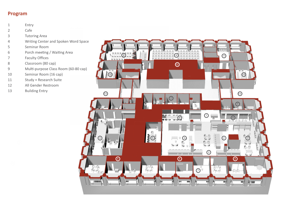
The site, within a brutalist building, is expansive and ringed by deep-set bay windows. The structure possessed a two-way coffered-slab system in concrete, hidden behind old dropped ceilings. The project deploys the critical writing program in two parts: seminar rooms and large-scale teaching spaces designed for flexibility are located to the north in a space limited by the presence of the core of the building. To the south, with a larger available floor plate and broad structural spans, the heart of the writing program is located - faculty offices, tutoring spaces, and the Writing Studio: a series of informal individual and two person tutoring spaces.
Upon entering the Writing Studio, a visitor is greeted by an oversize bookcase wall that houses artifacts of the program, resource materials, and collaborative white boards and tack boards for standing tutorials. Beyond the bookcase is a cafe, tutoring counters, and different scales of informal seating to encourage many different teaching engagements.
In the middle of the bookcase is a generous, but understated kitchen area. Early on in the conversation, the Client emphasized the historic importance of gathering over coffee to the success of the program. As such, the design places a café at the heart of the space, detailed to be consistent with the rest of the space.
In the public spaces, the depth of the bay windows is exaggerated to create two person alcoves for tutoring that is visually and acoustically set apart from the larger gathering areas. Corridors incorporate seating and white boards to afford the variety of learning and study spaces the Program sought.
As a way of “grounding” the design, original furniture from the old home of the Critical Writing Center were re-upholstered and given new life in the Center. Design studies, some digital and some by hand, studied the “life” of a space that was meant to feel raucous and quiet, dark and colorful.
Offices are organized along long corridors that behave like “streets” within the “neighborhood” of sub-programs of the Critical Writing Center. In order to offset the potential relentlessness of the existing building organization, these offices are grouped around “porches” that contain seating or meeting areas for colleague and student engagement outside the confines of an office. Wishing to avoid a clinical quality, the design uses color to create contrasting sensations of open-ness and enclosure and of warmth and cold.
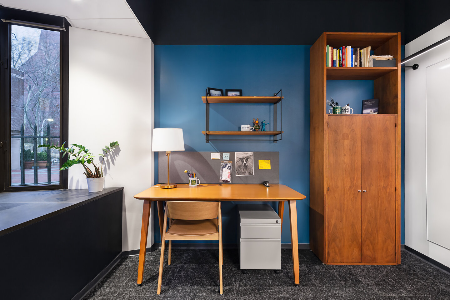
Offices are designed with the same exposed ceilings as the corridors and feature an interplay of colored walls to create variety. Solid walnut millwork have been re-used from some of the demolished areas of the project, re-finished and given new life. Even the book-shelves over the desks use re-claimed walnut shelves coupled with brackets found on the online marketplace, Etsy.
Along the north side of the floor, flexible classrooms are deployed beneath a dynamic concrete coffered ceiling that has been painted a dramatic palette of dark gray and white. Acoustic panels line the interiors of the coffers to attenuate sound and a variety of audio/visual components and linear LED tubes and downlights afford a variety of functions for the rooms.
With space at a premium on a University campus, the need for rooms to be usable as many hours of the day possible informed the design of the highly visible classroom spaces. During the day the classrooms are designed for standard daily seminar teaching. At night, with a prime location on the ground floor adjacent to a major pedestrian thoroughfare, the classroom can be quickly converted to an events space thanks to a sophisticated suite of audio visual capabilities, flexible furniture, and bi-folding white-board panel walls (acoustically sealed).
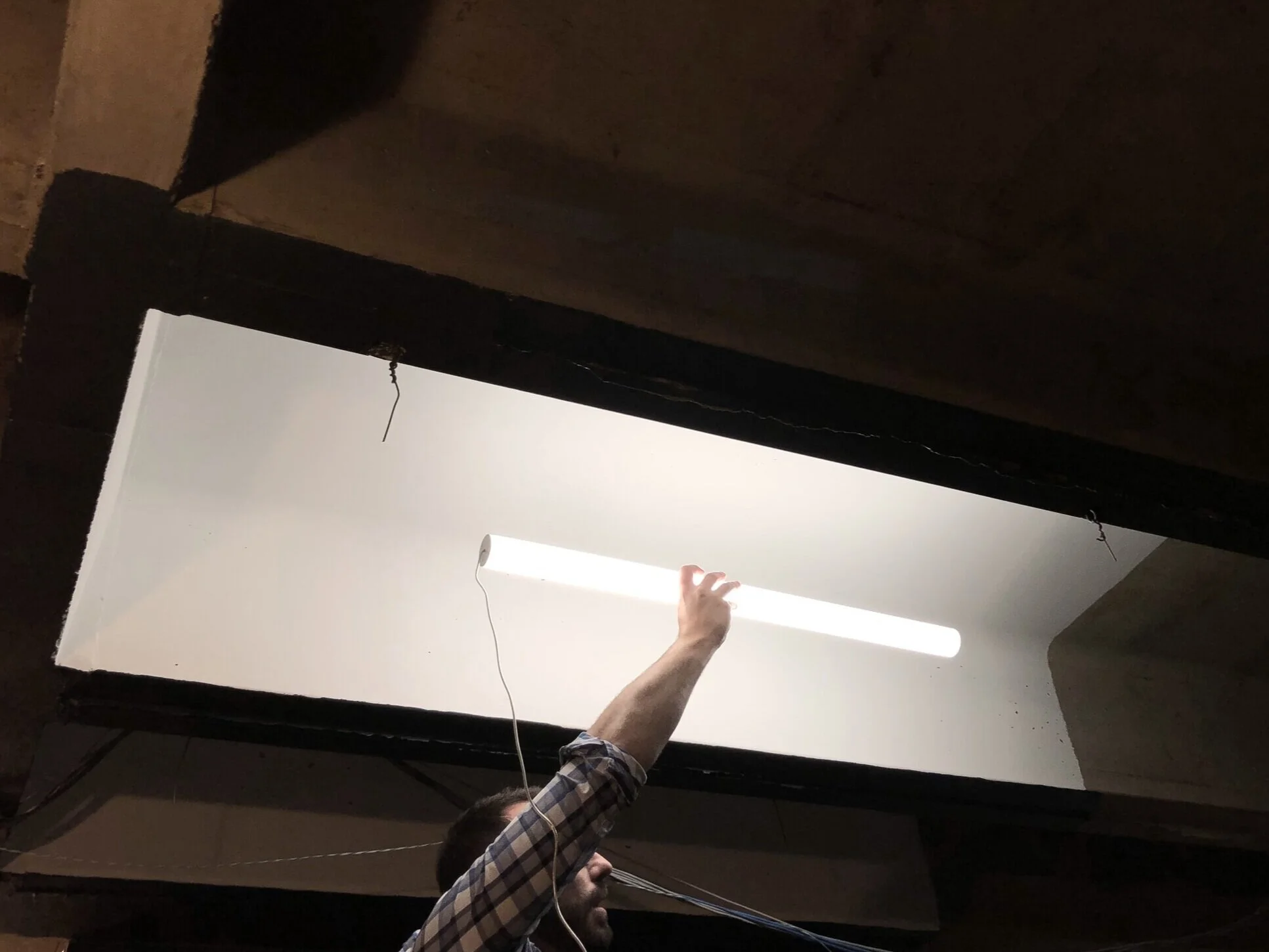
While the rawness of the original concrete felt out of step with the Program’s spatial goals - the team worked to find a way to reveal this form in a practical and subtle manner. Working with The Lighting Practice lighting designers a flat white paint coupled with new, minimal LED tube fixtures created a direct/indirect “light fixture” using the structure of the building itself. Here, lighting amplifies the formal strength and rhythm of the existing concrete structure. Minimal LED tubes, suspended from delicate cables creates the sensation of a floating column of light. In sound sensitive spaces, the coffers are in-filled with acoustic panels that cover the electrical conduit and LED drivers.
The existing floorplate enjoyed largely column free spaces that had been hidden under a diffuse assembly of rooms and corridors that also hid the raw beauty of the existing structural frame.
Photography by Devon Banks Photography
Back to Institutional + Commercial Work


