University of Pennsylvania Creative Writing Program
At the University of Pennsylvania, the teaching of creative writing (poetry, fiction) and critical writing (essay, argument) had been housed in a grand Victorian mansion only slightly removed from campus. The house was old, dark, cozy and wonderful in the way of an old bookstore. When an opportunity to expand the footprint of both programs into new buildings arose, the writers, educators, and Victorian house dwellers approached the concept with skepticism.
The Creative Writing Program, unlike the Critical Writing Program, moved from one residential structure to another. Studio Modh performed a thorough evaluation of the opportunities the building presented for a subtle versus aggressive scope of renovation was undertaken. When working with existing spaces, the previous design decisions for another function (the building was previously used as a dorm and later for a Forensics department) burden the new use in unproductive ways.
The more aggressive design introduces a new dynamic, open staircase that encourages auditory, physical, and visual encounters. The reconstruction of the staircase shifts the position forward in the house which enabled a new multi-purpose classroom and open lecture and events room to anchor the first floor. The shift also allowed the upper floors to be “re-zoned” for private faculty offices in the rear and a collaborative lecturer “bullpen” in the front that can be used by all staff when the part-time faculty are not present.
Philadelphia, Pennsylvania
Completed 2020
Artifacts of the old house are maintained selectively, anchoring the space in the legacy of its previous use. Old tiles buried beneath floor to floor carpet add color and detail to the space. A wall recess, bathed in red, displays the books of current and recent faculty, resources for students, and a collection of mailboxes.
A generous entry lobby, housed within the egress fire stair and lined in rated glass, creates a more public and visually accessible space for classes and events. Bright colors draw the eye through the space and subdued grays unify the new doorways and trim with the existing windows and fireplaces that dot the space.
The new multi-purpose classroom, designed with a thirty foot long wall of stacking glass panels, enables a traditional teaching environment and corridor to exist during the school day. Then, in the evenings or on the weekend, the Program can host talks or informal events that merge the space of the corridor and classroom. Stackable chairs are tucked into a closet under the pitch of the stair above.
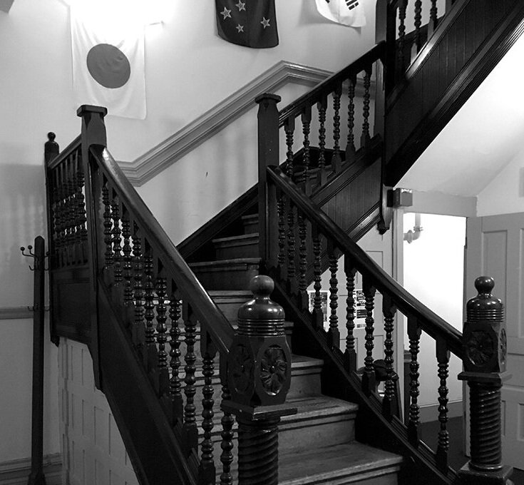
The stair is designed as one continuous ribbon that unfolds like an orange peel as the space rises to the roof. The guardrails are set off by a deep blue painted wall. The drama of the space is extended by pulling back the third floor opening to create a double height space capped with a luminous ball light fixture. The old stair, festooned with ornament and narrow landings and turns, felt enclosed and relentless.
The existing staircase, charming and idiosyncratic, was unsafe for the higher density of occupancy and met each floor at precariously undersized landings. The new design provided more space at the landings, enclosed the stair properly, and introduced a double-height atrium like opening to activate the space socially.
A new kitchen is built around the previous window openings of the rowhouse, unified by a palette of light gray tile and millwork. The bright red color picks up on the other areas of red on the ground floor.
Photography by Devon Banks Photography
Back to Institutional + Commercial Work


