Motivate + Citi Bike Offices
On the harbor's edge of Industry City, the weight and history of the cast in place concrete and wood flooring is ever-present. The design of the new Citi Bike / Motivate office and proto-type bike development spaces required a ruthlessly efficient plan that balanced the desire for collaboration and open-ness with the challenges of mitigating noise and providing privacy.
This expansion enabled the Citi Bike to not only upgrade the effectiveness of their workspace but to also re-conceive a better way of working collaboratively. To retain historic, hard surfaces while still designing an open office where a large staff could talk to each other and on the phone throughout the day, the design early on focused on an architectural solution for privacy and sound attenuation. The design of the new Citi Bike / Motivate offices needed to employ a ruthlessly efficient plan that balanced the desire for collaboration and open-ness with the challenges of mitigating noise and providing privacy. In order to retain the historic, hard surfaces while still facilitating an open environment where a large staff could talk to each other and on the phone throughout the day, the design early on focused on an architectural solution for privacy and sound attenuation.
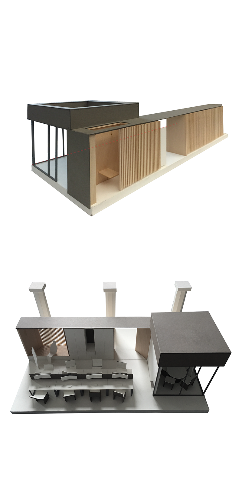
The solution is built on the visual geometries of the existing concrete joists and honey colored industrial oak floors to create a “Swiss Army Wall” that weaves throughout the 13,000 SF space. The flexible wall is both barrier and vessel for myriad programmatic activities, creating a gradient between the working, creating, collaborating, and thinking spaces. The wall element separates departments, encloses functions (phone booth, maternity booth, whiteboard niches, coat closets, IT closets, etc...) while also serving as a sound disrupting and absorbing surface that still affords light and air to pass between spaces.
Brooklyn, NY
Completed 2018
2018 Brooklyn AIA Design Award Winner 2018 NYCxDesign | ICFF | Interior Design Magazine Finalist
The northern conference room from the kitchen with the bi-fold glass wall open. Thick industrial felt baffles hang from a cut out in the ceiling. The baffles are tapered to echo the shape of the existing concrete joists above. The walls are detailed in carefully choreographed dark and light colors to allow full height magnetic whiteboard walls to blend seamlessly with the rest of the architecture.
The solution built on the visual geometries of the existing concrete joists and honey colored industrial oak floors to create a “Swiss Army Wall” that weaves throughout the 13,000 SF space. The flexible wall became both barrier and vessel for a myriad of programmatic activities, creating a gradient between the public and private. The wall element separates departments, encloses functions (phone booth, maternity booth, whiteboard niches, coat closets, IT closets, etc...) while also becoming a sound disrupting and absorbing surface that still affords light and air to pass between spaces.
The design of the new Motivate offices are a modern evolution of the original industrial workspace where fly wheels, chains, and pulleys ushered in the early twentieth century of New York City. Today, those wheels and chains happen to be on bikes that are ushering in a new sustainable twenty first century transit future.
Conference rooms are designed for more formal meeting use as well as more informal gatherings once sliding glass walls are pulled away. Above, the largest conference room opens two walls adjacent to stair risers that double as seating for “All-hands” talks and training.
At the staff entry, a generous lobby greets on-site and visiting staff. A sculptural undulating wall of cubbies and black coat hooks offer an array of storage options from jackets to bags, bike helmets to bass drums.
A large open kitchen is located adjacent to the office entrance. The space is detailed and designed consistent with the work and collaborative spaces to encourage informal meetings, events, and other activities to take place in a seamless manner. Sliding and bi-folding glass walls open onto the space when happy hour or other events take place requiring food, drink, and abundant space for guests and staff.
The Swiss Army Wall is detailed with unfinished red-oak battens to more closely match the floors, recycled rubber acoustic panels behind the battens, blackened steel hardware, and a dark gray lacquer frame to transition between carpentry and millwork. The wall reveals views toward the light, enables access to meeting areas, and occasionally slides away to reveal small phone booths lined in felt acoustic panels and oak.
Early representations of the space highlighted the primacy of the roof structure, columns and flooring. Newly built elements would have the character of simple “urban” forms situated under the “sky” of the concrete structure. As such, ceiling openings in conference rooms took on the character of skylights.
Photography by Devon Banks Photography
Back to Institutional + Commercial Work


