Kensington Townhouse
Renovating an older building is one of the most sustainable things we can do in a city. However, there is a tension between what can be preserved and what must be renewed in order to create a new home that will live in the twenty-first century.
For a one-hundred-year-old limestone rowhouse in the Kensington neighborhood of Brooklyn, a modern design solution arose out of the historic fabric and details of the house, restored to meet the needs of a contemporary family of five. Stone, brick, and metal facades were restored to maintain the building’s connection to its immediate neighborhood. Along the west side, double-hung windows maintain the scale and cadence of the street, while the garden windows follow a more contemporary line to capture as much light as possible and include views of the back garden.
Brooklyn, NY
Completed 2018
The design maintains the location of the existing window openings. This respects the neighboring facade rhythm and minimizes costly structural modifications. As such, the design accommodates the functionality of rooms but also melds contemporary uses with the historical detail and symmetry of the house.
The selective restoration of building elements included the Parlor Floor parquet flooring detail, and the original stair. In a nod to the previous grand entry doors to the living room, a new pair of minimal door panels hide bookcases and other family storage.
Ornate parquet flooring, hidden under carpet, is reborn and matched to the new floor plan. The dining room, previously wrapped in dark wood, millwork, and small doorways, was deconstructed and rebuilt using infill panels and details pulled from other rooms in the house. A palette of pale blue and gray permeates the parlor floor to contrast the white ceilings and dark oak floors.
In the previous floor plan, the double pocket doors facilitated movement between the living and dining room only. Using reclaimed wainscot panels and details from other portions of the house, the new design creates a paired opening to the kitchen that draws much needed natural light into the center of the house and reflects the centrality of the kitchen in the life of the house.
The kitchen occupies a narrow addition that has been further lengthened with the addition of a glass box that affords abundant light and views of the garden. The limited footprint of the kitchen led to the design of a small slatted-steel terrace with a full-width staircase to ensure views are unobstructed by handrails. The door opening to the kitchen has been widened to match the formal pocket doors to the living room. This gives the spaces a symmetry and processional quality and allow them to be isolated for dinner occasions or to buffer the cacophony of family life.
While color is subdued throughout the house, gray and blue-gray paints unify the new carpentry and millwork details with the old. Rich detail and texture thus become an artifact of living in the new and old house, before a background of luminous wall and ceiling planes, which draw light deep into the interior.
The house is an artifact given new life and purpose.
The design resurrected a underutilized cellar, dividing the space between service areas (boiler, laundry) and an open flexible play and living space for the family. Maximizing light and spatial generosity were priorities as exemplified in the design of the solid oak open riser staircase threaded into the old service stair structural opening. Light in the stair is borrowed from light passing through a glass pocket door in the laundry room.
On the second floor, where the family sleeps, bedrooms pinwheel off of a central landing.The landing is capped by an accessible skylight for roof access that pulls the ceiling upward into a pyramidal shape. The ceiling planes are a series of pyramidal volumes each drawing and amplifying light from the existing roof skylights above.
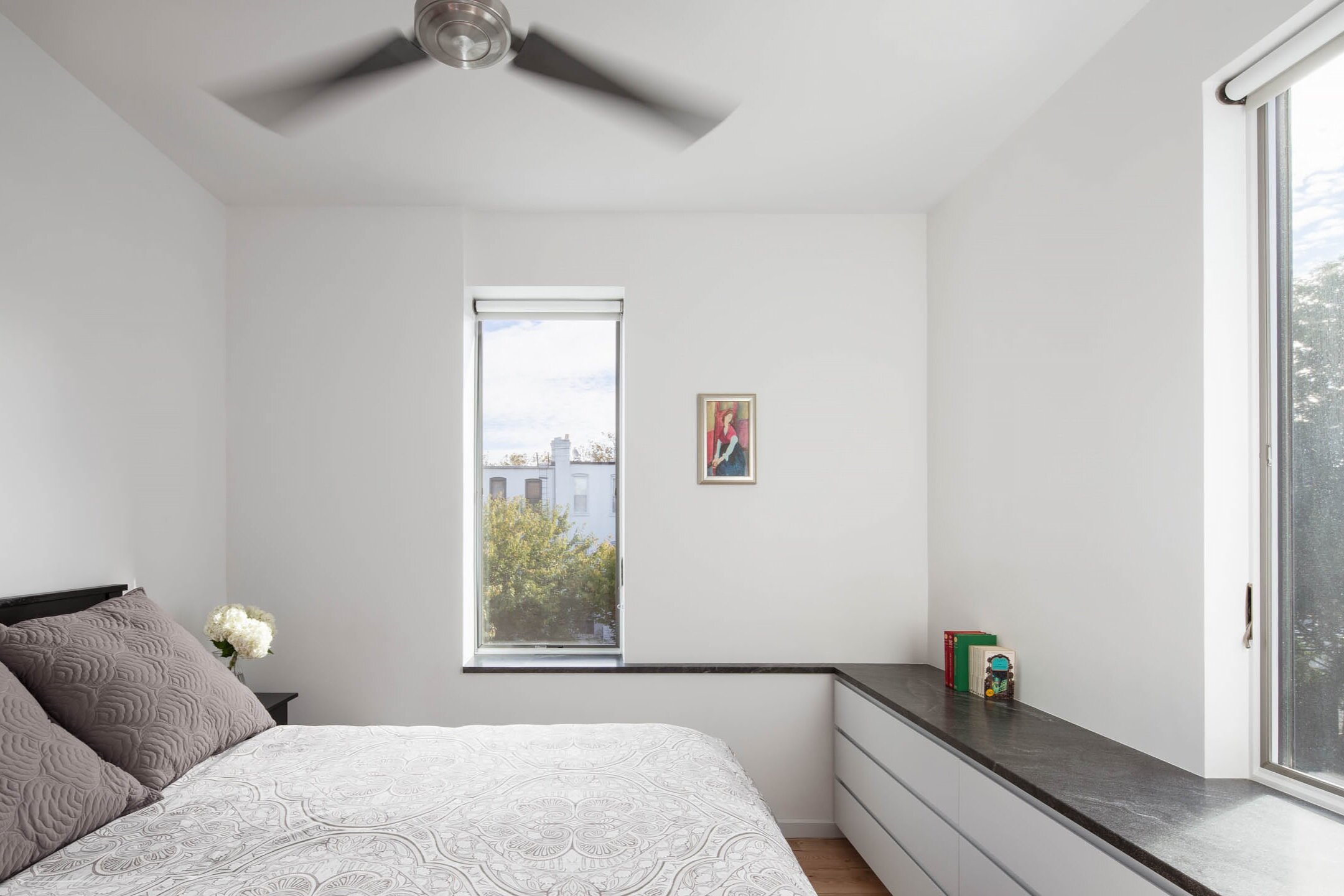
The master bedroom fills the narrow back extension of the upper floor. Storage and millwork is carefully folded into the walls that separate the bedrooms providing an added acoustic buffer as well as filling inefficient spaces formed by chimneys, structure, and risers.
The rear addition, re-built in the existing zoning footprint, creates an open corner to the southeast to maximize morning light in the narrow kitchen. Due to the small footprint of the kitchen, a new steel deck is sized for moderate weather dining. The stair is directed outward to minimize railings and maximize views from within the living spaces.
Pre-Renovation:
The house was configured as three individual apartments, carving up the floors to accommodate kitchens, bathrooms, bedrooms, and living rooms.
Post-Renovation
The new plan consolidates storage in massive walls that separate each room, affording better acoustic separation as well as providing more generous and flexible rooms.
Photography By Devon Banks Photography
Back to Residential Work


