CADE Competition
Center for Architecture and Design Education
The Center for Architecture, Design, and Education (CADE) is a pairing of two buildings, one solid and one transparent, that are configured as “windows” into the individual and collaborative learning that is the foundation of the creative discipline of architecture.
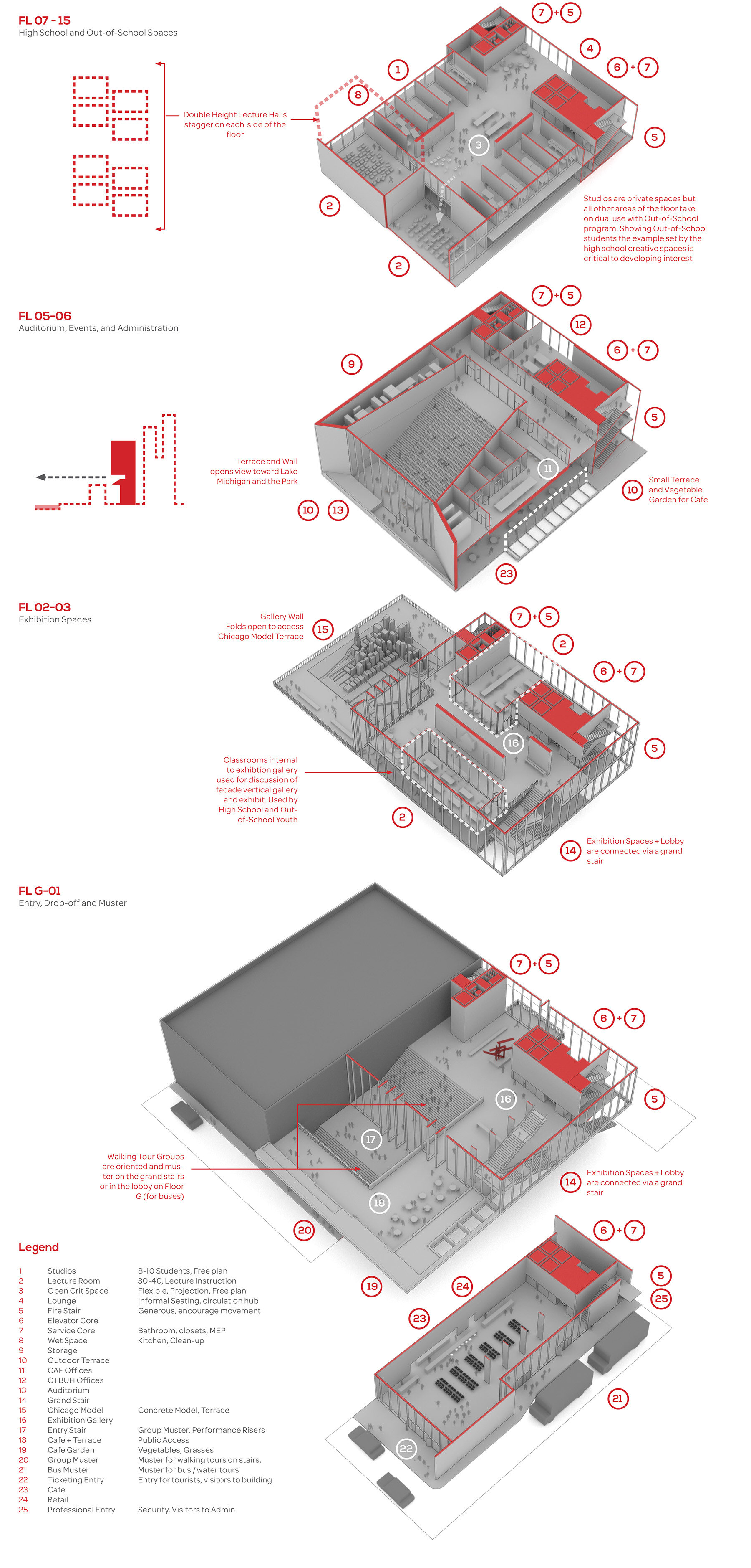
Within the solid tower, these “windows” occur as massively scaled openings focused on particular educational moments – the recitation of knowledge to a large audience within an auditorium on the south side, the hive of individuated creativity within the studio on the east and west facades, the importance of the body as seen through a roof top court, and the vitality of chance interaction that occurs in lounges on the north side of each floor.
The glass base, precariously supporting the weighty tower above, is the window thrown open to the city inviting a physical and visual conversation between the passerby, the visitor, and the student. The window in this case is a living thing: opening and closing with the seasons and wrapping and shedding itself in dynamic façade treatments that reflect the artifacts of the exhibition spaces within.
The core of the vision for CADE is the expression, both in construction and planning, of the unique creative process that a design education provides. Program is distributed and overlapped to encourage collaboration and chance meeting throughout the building – through generous, glass stairs that connect floors and carefully distributed large scale gathering spaces. But more importantly, the building gives space for students to explore, fail, and succeed at thinking and making as creative individuals. Student workspaces within rooms that are designed for a small group of peers form the heart of the building. It is in these spaces that the seed of a creative life are planted.
Competition 2015
Finalist
The Building, as the Center of Architecture, honors the two predominant construction types in Chicago: the historic, heavy masonry building and the contemporary, delicate glass skyscraper. The design uses opportunities like this to ask visitors and the passerby to evaluate their assumptions about building in their life and environment. In this case, the relationship of the heavy masonry and light glass tower are inverted depicting not only the opportunities of contemporary construction, but also exposing the functional benefits of these kinds of solutions. The massiveness of the tower communicates its cultural and educational significance and the collection of “Windows” places the building at the scale of the larger city-scape.
( TEXT PART 4 ) Phasellus sodales massa malesuada tellus fringilla, nec bibendum tellus blandit. Donec ac fringilla turpis. Fusce at massa nec sapien auctor gravida in in tellus. Suspendisse nec congue purus.
The Roof Window captures vistas of the sky from the court that lies beside the basketball gym. In summer, massive glass doors are opened to enable indoor/outdoor use. In winter the doors lock in place at a low slope angle to form a glassed in court that benefits from abundant sun and shelters students from the cold.
At night the building turns inside out and becomes a vitrine for the learning process. The large openings are transformed into a collage of activity displaying particular types of learning: Large scale lecture in the auditorium, the hive of individual creativity within the studio and classroom floors, and the intersection of learning and application within the exhibition spaces.
The outer walls of the glass exhibition volume of the building are conceived as a vertical exhibition gallery. Every six months, similar to a typical curatorial schedule and coinciding with a change in the seasons, the façade receives a new exhibit specific installation that would cover as much or as little of the façade as is practical and appropriate for the exhibition goals. Heavy, structurally framed window units (some fixed and some operable) would facilitate the attachment of elements that demonstrate the particular hypothesis of the show within. The operation of the frames enables installation from within the building without having to erect a scaffold. The examples here depict two hypothetical shows: the first is an exhibition about vertical gardens, using planting trays attached the façade that enable the installation of a deciduous plant alongside a flowering creeper vine.
At the street level, small “teaser” elements near doorways afford a casual passersby the opportunity to “smell the roses” as they glance across the full facade installation.
Back to Ideas + Research Work


